Oregon State University
College of Business
While migrating between Content Management Systems, The OSU Business College brought in my team to overhaul their site’s usability and visual identity in an effort to make it easier for current students to navigate and more enticing for prospects.
Time to read: 2 minutes
Timeline
3 months
MY Roles
UX/UI Designer, User Researcher, Usability Tester
Tools
Figma
Deliverables
Styled Component Library, Hi-Fi Prototype
Challenges
1. Identifying Target Audience(s)
Despite knowing that OSU wanted to design for “Students, Prospects, and Parents/Guardians”, this left us with more questions about how to focus our efforts due to the broad range those groups covered. For example, “Students” could mean Transfer students, Grads, Undergrads, etc. How do we differentiate between these user groups?
2. What do Students Want?
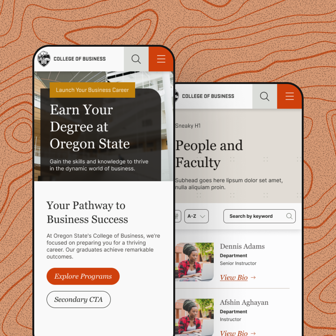
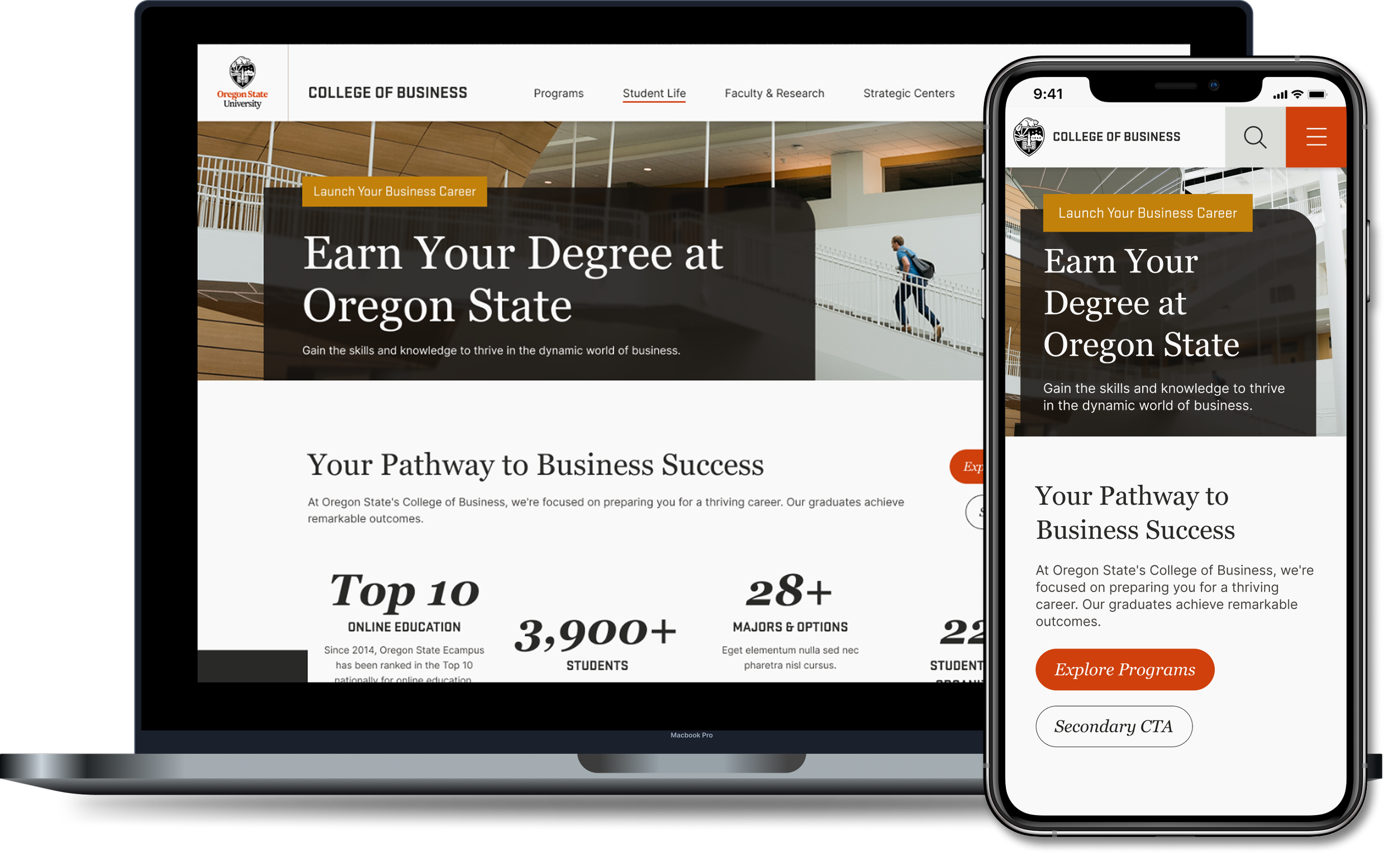
With such a wide range of user groups to design for, the content of the homepage became an early conundrum. A Competitive Analysis of similar universities saved us a lot of time, allowing us to focus on how to position the college in the marketplace by highlighting it's unique offerings and quantitative achievements.
3. Aesthetic
One of the main questions in the discovery phase was where to take the site’s visual identity. Did we want a bright and inviting palette or one that was darker, sleeker, and more professional? Once wireframes were complete I took charge of exploring the ladder concept. We would eventually decide to move forward with a light palette, but included the darker tones as an accent color for contrast.
1. Card Styles
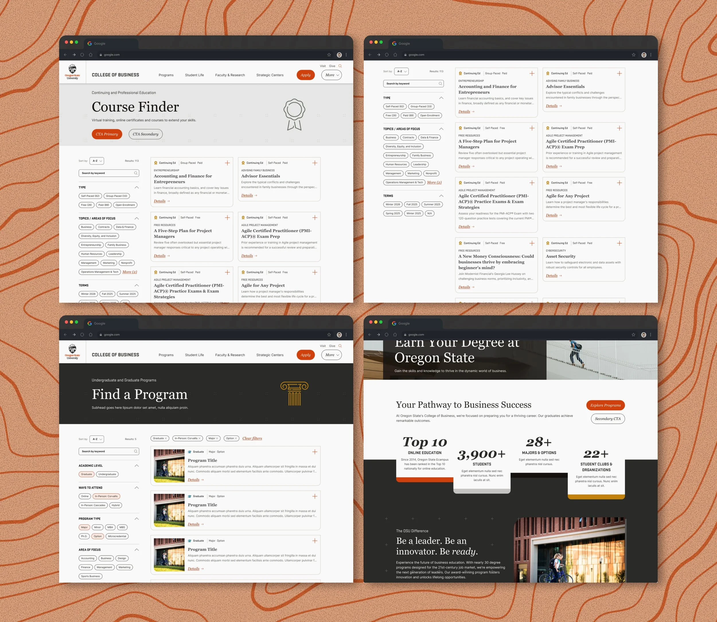
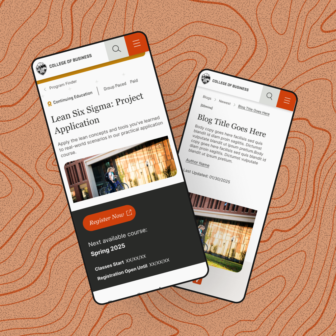
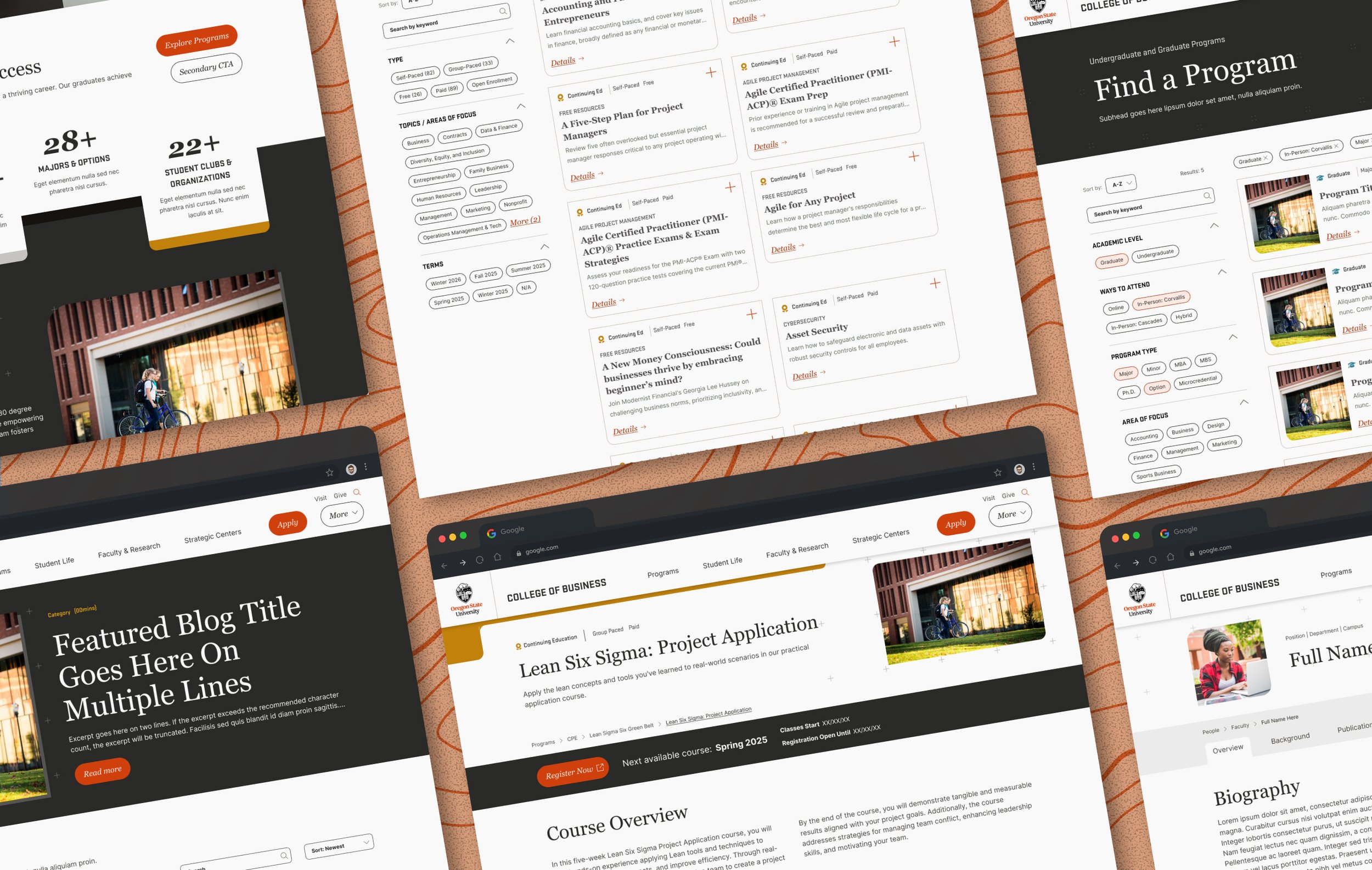
Given the wide array of content and services an institution like OSU offers, it was clear early on that we’d need an equally wide array of organizational components to convey that information. My answer was a comprehensive suite of Card layouts and variants which could be used to address course info, dynamic blog-like articles, employee highlights, long-form content, testimonials, and more.
2. Program Finder
An integral part of the college experience is signing up for classes. With this in mind I created a Program Finder to enhance the discoverability of OSU’s courses. It allows users to search by keyword, sort alphabetically, and filter by course type, field, semester, and more. Those course filters can also easily be edited by university admin to maintain accuracy as the offerings grow and evolve over time.
3. Color & Iconography
OSU’s courses fit under 3 broad umbrellas: Undergrad, Graduate, and Continuing Ed (CPE). To differentiate between these without creating distinct components for each, I assigned a unique color and icon for all three. This greatly improved site scannability and clickthrough rates.
Solutions
The Deliverable