CSC ServiceWorks
Reworking an eCommerce marketplace to grow brand identity.Time to read: ~2 minutes
Project Background
As the leading provider of laundry solutions and air vending services through the United States and Canada, CSC brought in my team to enhance their “CSC Marketplace” experience, which offers deals and coupons to individuals living in apartments or areas that CSC services.
NOTE: This project is currently ongoing, and the images here may not represent the final product.
Challenges
There were multiple conflicting client visions for this project, which caused tension and disrupted development timelines.
Despite its success as a service provider, most users aren’t aware they’re serviced by CSC, so the trust necessary for a successful marketplace is missing.
Early testing showed confusion around the purpose of the site. It was relying too heavily on name recognition that wasn’t there.
Solutions
To prevent spending more time designing layouts that would be scrapped, we focused on refining the minimum viable product: a set of base pages necessary for any functional eCommerce site. We left everything else as wireframes until it was unanimously approved in client meetings.
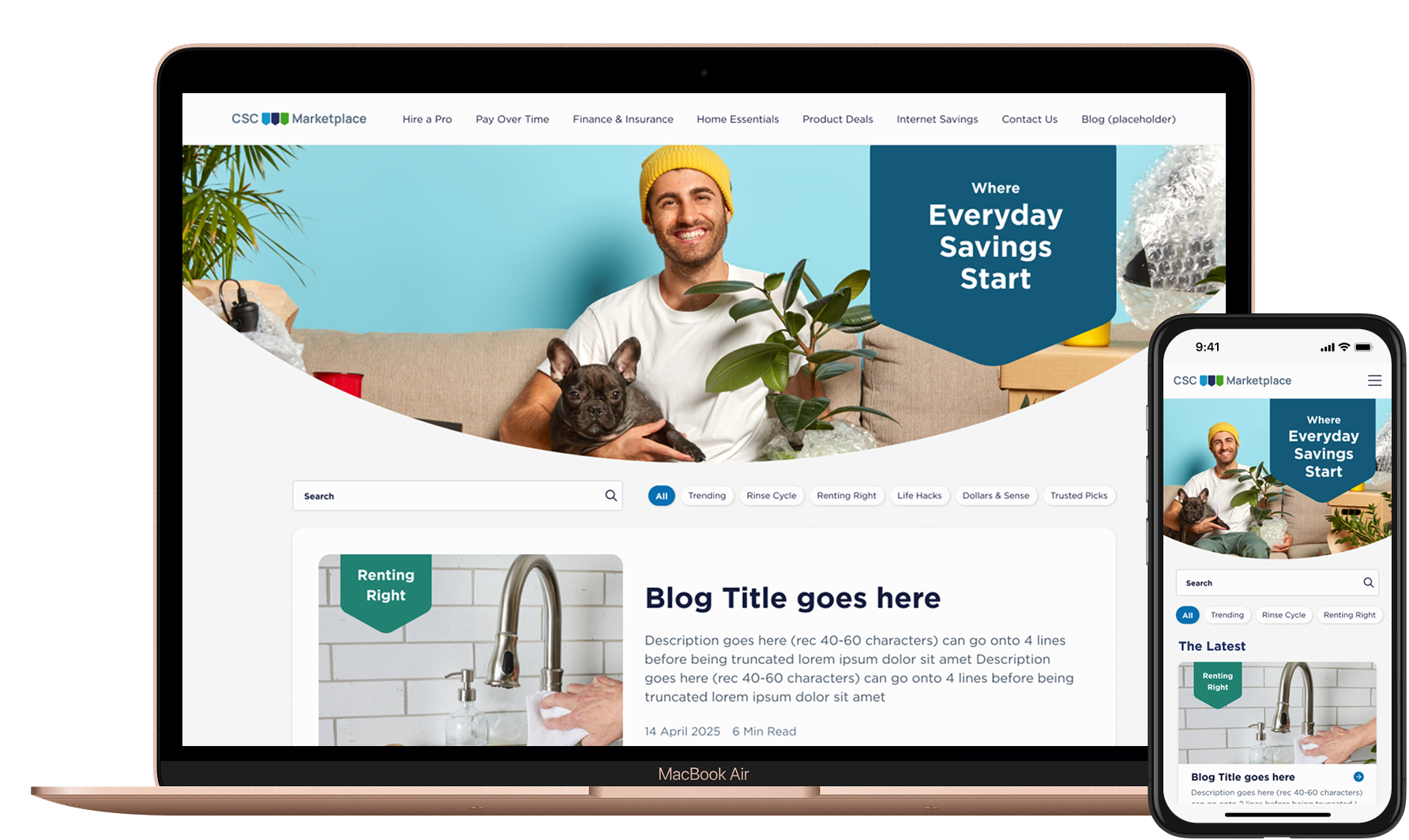
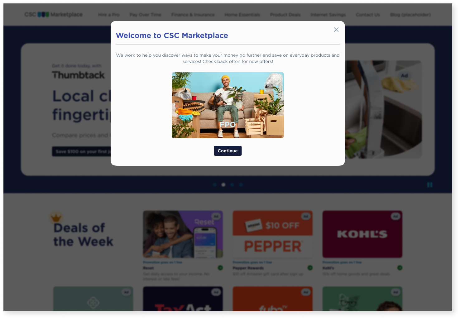
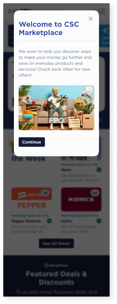
Building familiarity with the brand became the top priority. We added an introductory popup explaining the marketplace and why customers had access. This serves as a way for CSC to introduce themselves to their customers, so trust can start being built.
To solidify the site’s purpose, we reorganized homepage content to showcase the primary suite of offers. We also reduced the content shown to avoid information overload.
Responsibilities
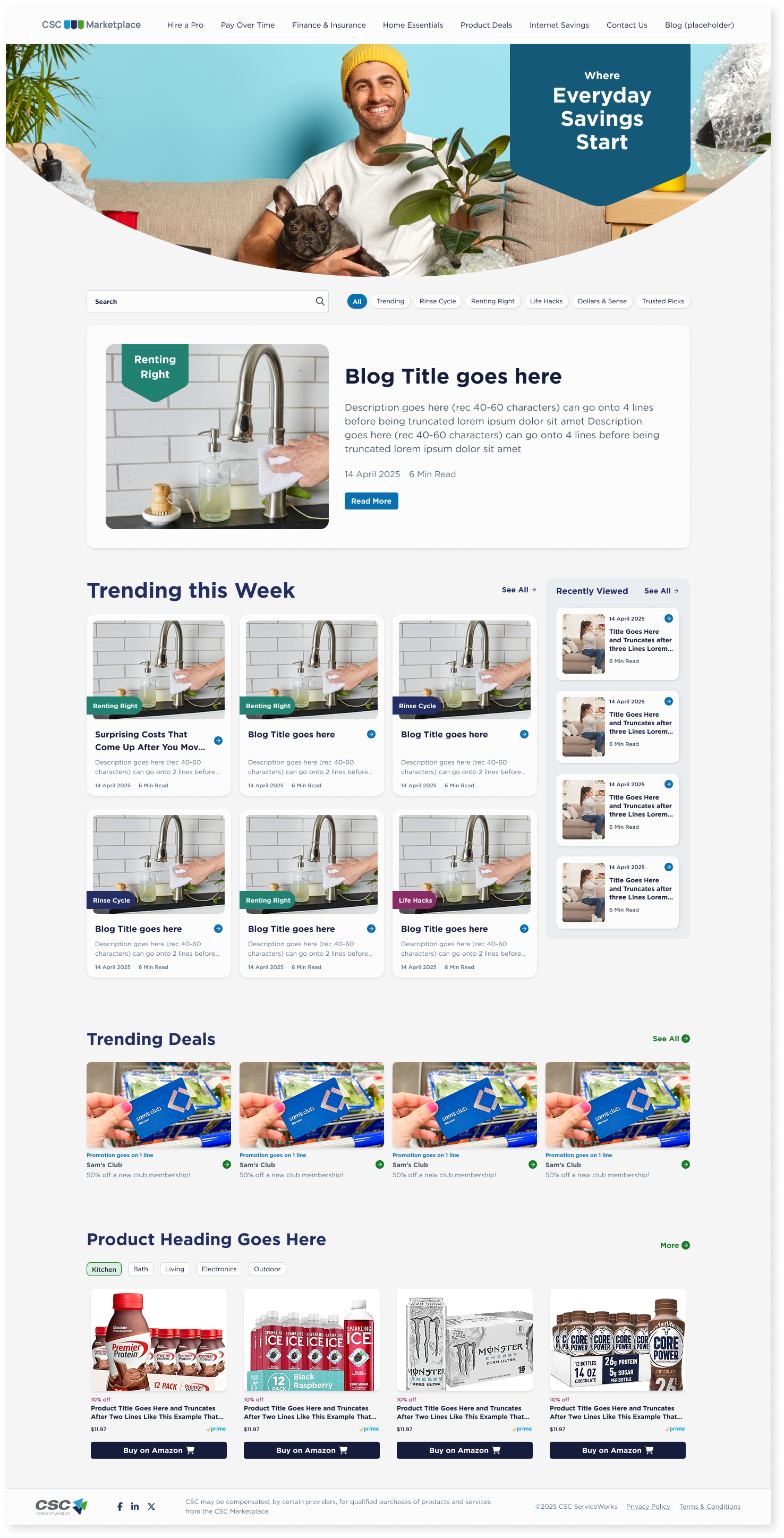
Create a core suite of cards to distinguish between Deals, Product Offerings, Ads, and Articles.
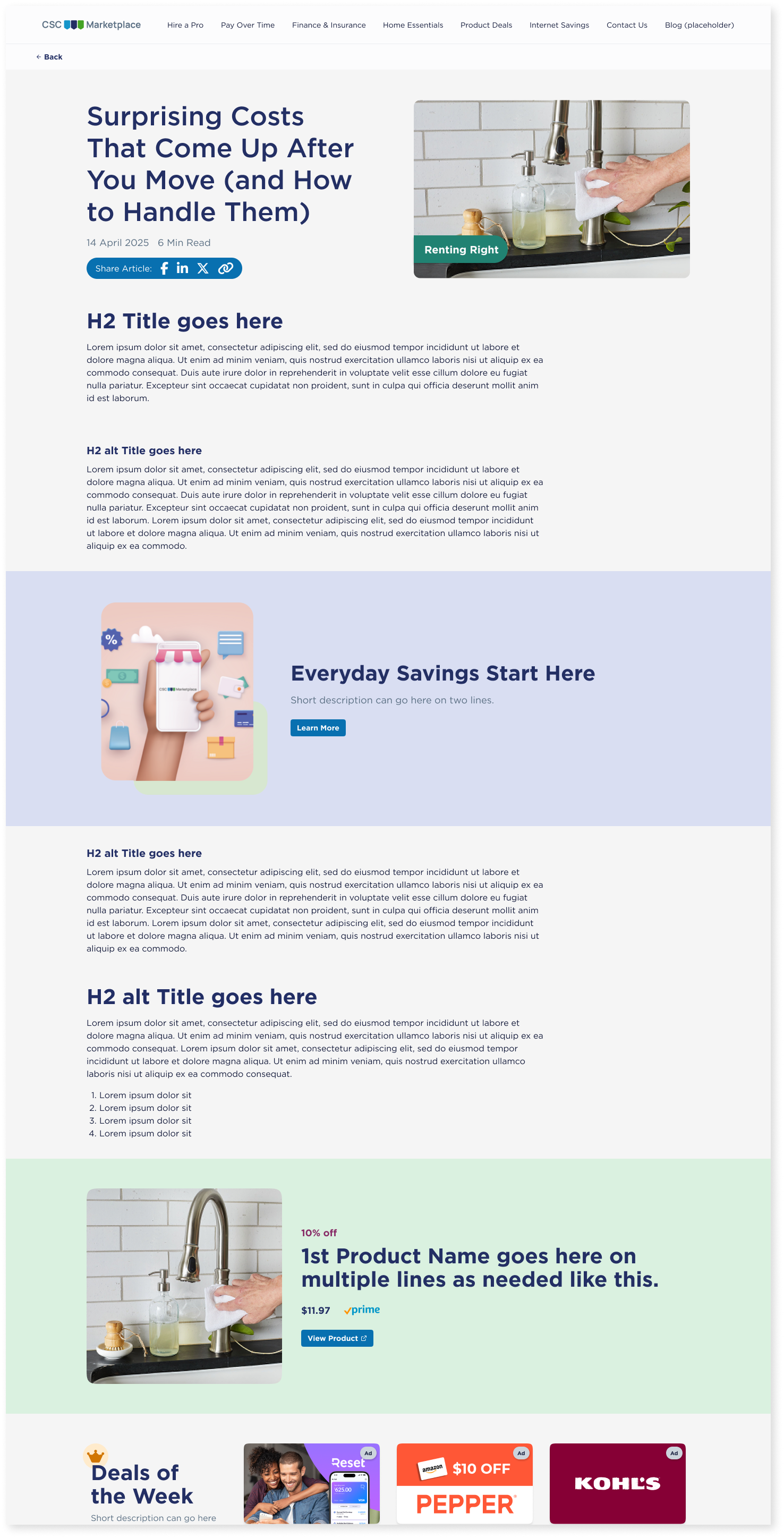
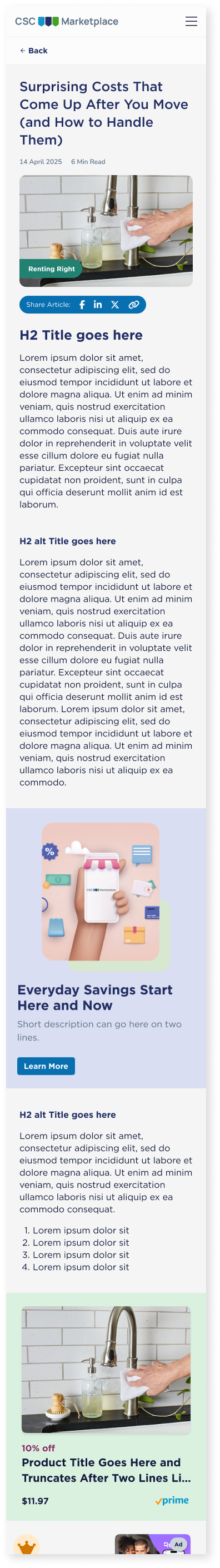
Manage the creation of a Blog, including the browsing, filtering, and reading experiences.
Conduct user tests to gauge audience understanding and see where attention was being drawn.
Design introductory popup and its logic.
Create a landing page for seasonal offerings and how it integrates into the marketplace filtering.
Assist development through QA testing and logging Bugs at regular intervals.
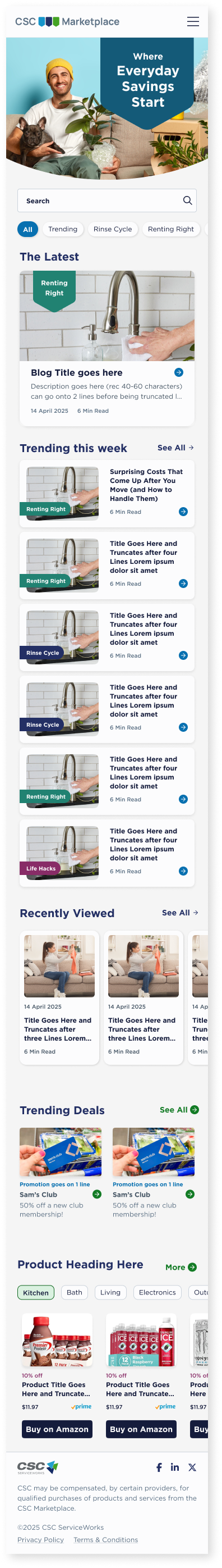
Blog & Card Styles
Blog content was informed by a competitive analysis of other “rewards” marketplaces. We found that necessary additions included the following:
Prominent imagery.
Featured content.
Mobile-first design.
Main blog page only serves as a hub.
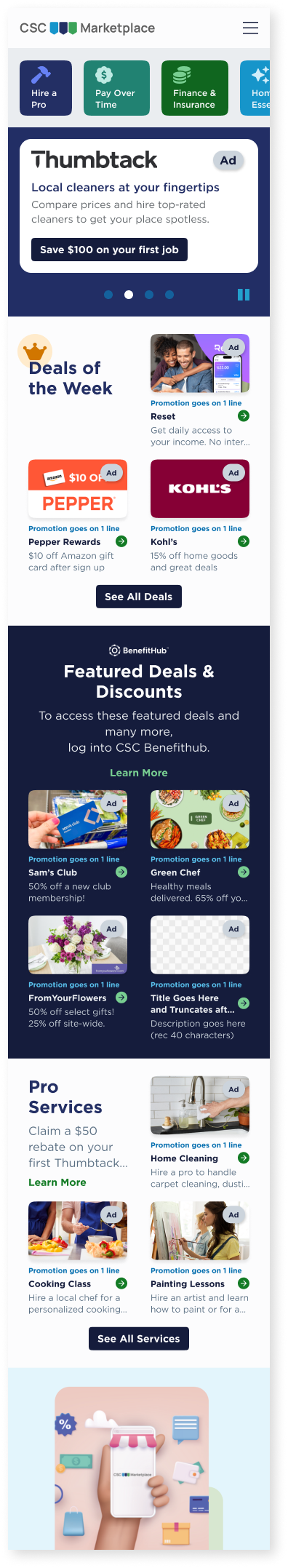
Homepage & Introductory Popup
83% of users were more likely to engage with the site when an image was present in the Introductory Popup and Hero Carousel.
67% of users preferred the Deals of the Week to be the most prominent feature. Removed image on mobile Hero to keep Deals above the fold.
With these changes made, the site had a 55.3% higher conversion rate than the initial design.
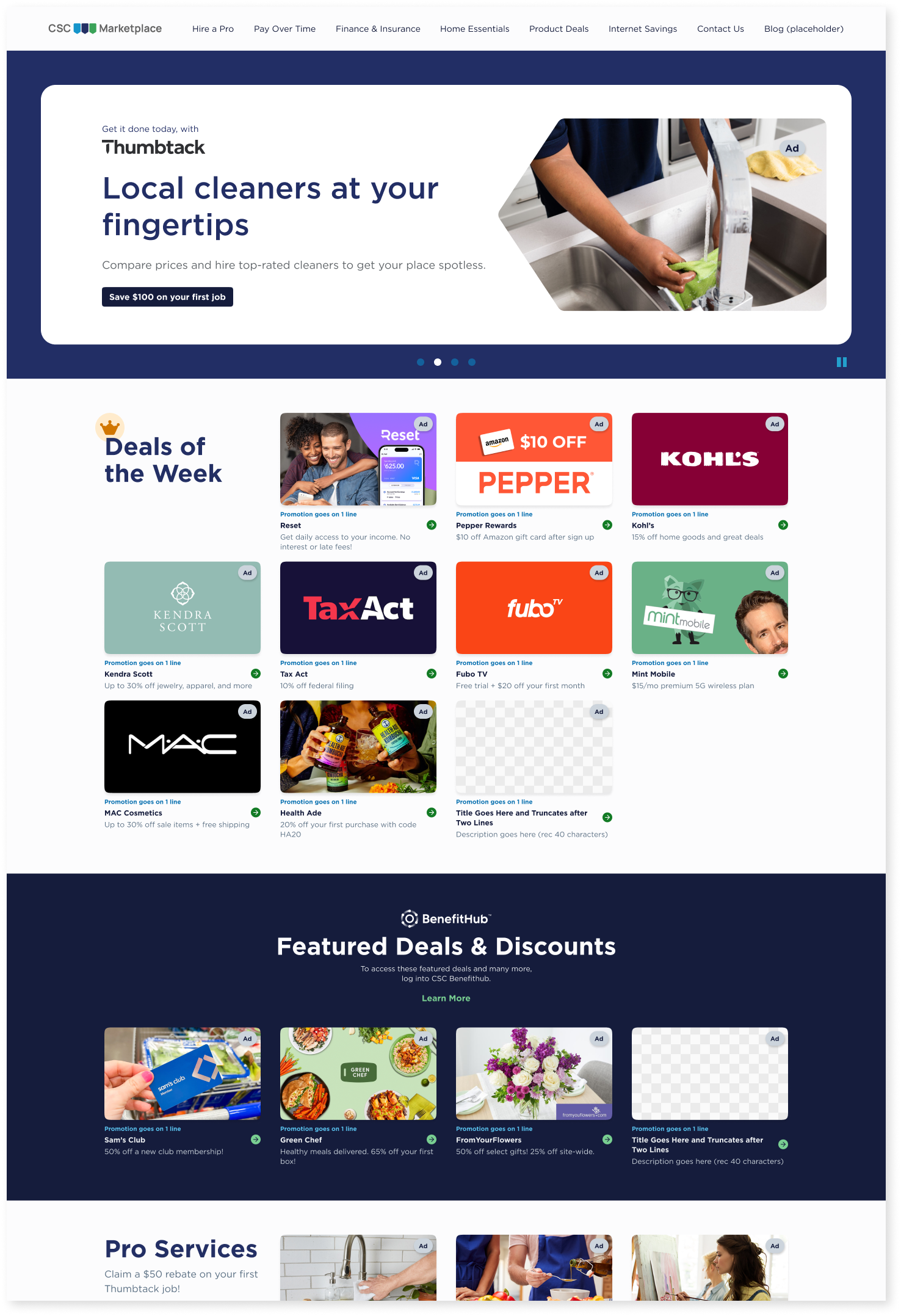
Categories & Seasonal Offerings


Pulled primary product categories out of the top menu on touchscreen devices to make navigation quicker and easier.
Categories were given unique colors and iconography to improve recognition.

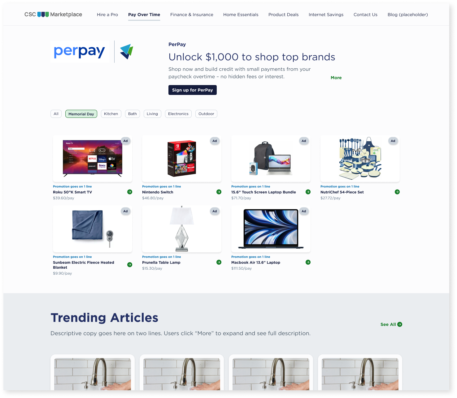
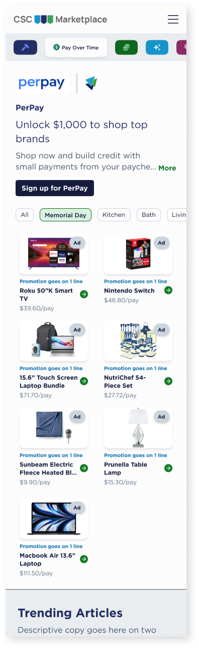
Added a dedicated Tag for Seasonal Offerings, allowing Site Admin to quickly mark relevant items.
Seasonal Tags were also given priority in the filtering order, greatly improving their visibility to users.